
Bright Spring Colour Analysis: A Complete Guide
Have you ever pulled on a muted beige top and wondered why your sparkle just vanished?
Or maybe you’ve zipped into a zingy turquoise skirt and thought, “Yes, this is my moment to shine!” If those bold, punchy hues make your heart sing and your mirror selfies pop, you could be a Bright Spring. And trust me, your wardrobe’s about to become your new best friend.
Bright Spring is a dazzling standout in the 16-season colour analysis system, mixing spring’s warm glow with a vivid, electric edge that nods to winter’s clarity. It’s the perfect balance between True Spring’s sunny freshness and Bright Winter’s cool intensity.
This guide’s your ticket to discovering if Bright Spring’s your vibe, unlocking the bright spring colour palette that lights you up, and mastering a style that feels like it’s been yours forever. Ready to turn heads with every step? Let’s jump in!
Bright Spring Colour Key Characteristics
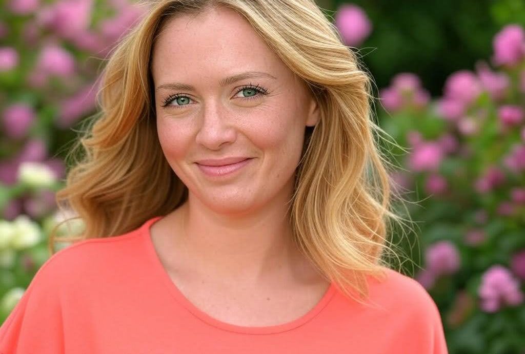
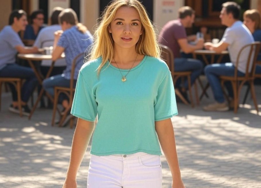
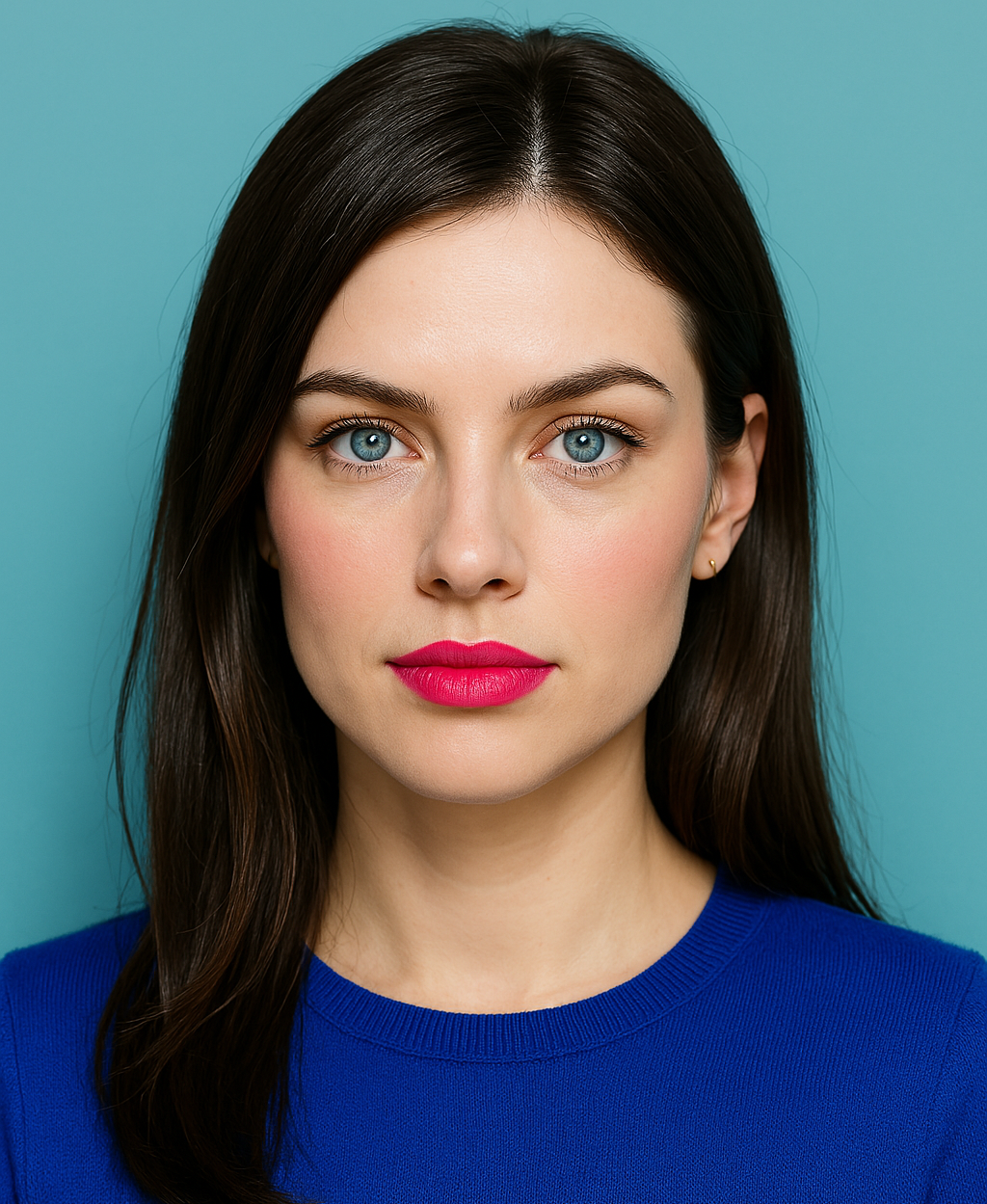
Picture your skin with a warm, luminous glow, like it’s lit from within, radiating energy with a golden or peachy kick.
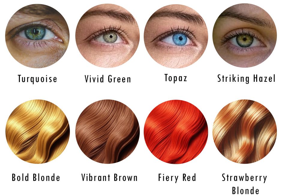
Your hair’s rocking bold blonde, vibrant brown, or a fiery red with a glossy, eye-catching sheen that turns heads.
And those eyes? They sparkle in vivid green, turquoise, topaz, or a striking hazel that’s impossible to ignore. If you light up in intense, clear hues, such as electric pink or crisp turquoise, but feel flat in anything muted or dull, Bright Spring might just be your match.
Not sure where you fit? Then try our free and easy-to-use colour analysis quiz to get started.
Bright Spring is the boldest bloom in the 16-season colour analysis system, bursting with warmth, clarity, and a high-energy vibe that sits perfectly between True Spring’s fresh warmth and Bright Winter’s cool intensity.
This bright spring palette is all about colours that match your spark: vivid, warm, and unapologetically alive. Imagine slipping into a sunny yellow top or a poppy orange skirt. Suddenly, your whole look’s electric, and you’re not just wearing colour, you’re owning it.
Warm Spring Characteristics Overview
The Bright Spring Palette: Hue, Chroma, Value Made Simple
So, what’s the magic behind this? Colour analysis uses three key ideas: hue, chroma, and value, to figure out your perfect shades. Don’t worry, they’re easier than they sound. Here’s how they shape the bright spring colour palette and why it’s a standout.
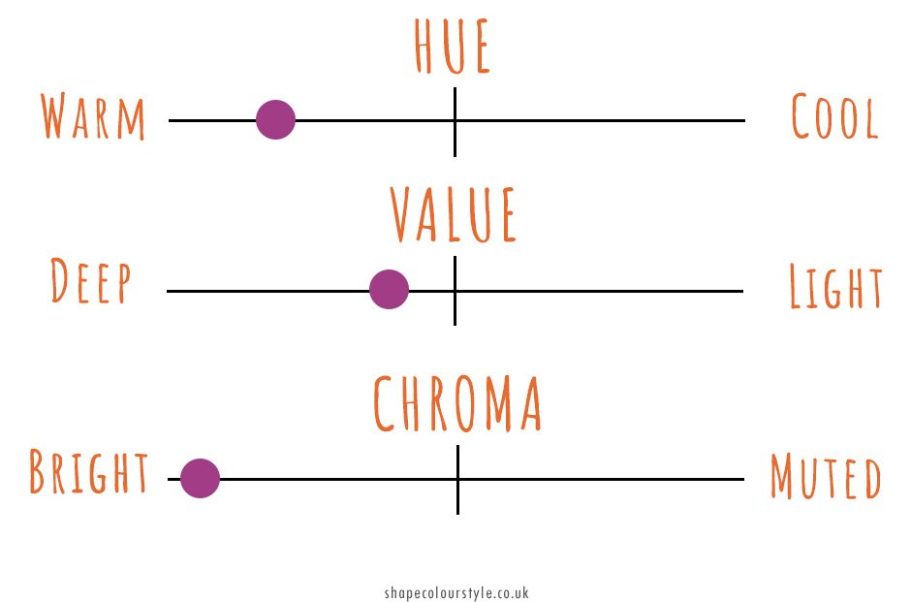
Hue (The Warmth Factor)
This is a colour’s temperature, how warm or cool it feels.
Think of it like picking a mood. Warm colours have a yellow or golden base, like a sunny day, while cool ones lean blue, like a winter sky.
Bright Spring is mostly warm but flirts with a touch of coolness from its winter edge. You’ll find vibrant corals, sunny yellows, and warm turquoise here, colours with a golden twist that feel alive, not icy.
Value (The Lightness Level)
This is how light or dark a colour is, like adjusting a dimmer switch.
Light colours have more white, and dark ones have more black. Bright Spring leans medium to light, think clear, sunny shades with a lift of brightness. Most colours here are bold yet lifted, though you’ll get a few deeper pops.
It’s fresher than Bright Winter’s stark contrasts but punchier than True Spring’s breezy tones.
Chroma (The Boldness Boost)
This is how intense or soft colour is, its personality.
High chroma means bright, clear, and punchy, with no grey dullness, while low chroma is muted and subtle. Bright Spring colours are high-chroma champs, vivid and full of life, like a zesty lemon or a brilliant chartreuse.
They’ve got that sharp, eye-catching edge compared to True Spring’s softer warmth.
This is your bright spring palette, vivid, warm, and buzzing with energy. Ready to ditch the shades that dim your dazzle and step into bright spring colours that make you radiate like nobody else?
Hang tight, we’ll show you how to rock Bright Spring like it’s your secret weapon.
Bright Spring Capsule Wardrobe Colour Palette
The bright spring colour palette is the heart of this season, bursting with vivid, playful energy that’s all about you, my bold ladies. Your capsule wardrobe should reflect its clear, dynamic essence, think of a sunny festival in full swing.
Picture these cornerstone colours as your go-to for timeless versatility: vibrant coral, crisp turquoise, sunny yellow, bright ivory, and fresh lime green.
These bright spring colours are the foundation of your style, offering a radiant, cohesive base that amplifies your high-energy presence.
A coral top, a turquoise skirt, or a lime green jacket mix and match effortlessly, keeping your bright spring outfits bold and functional.
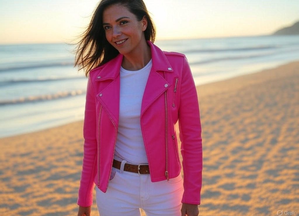
Style Tip: Go for bright spring clothes like a turquoise statement top with white jeans or a coral dress for date night. It’s vibrant, it’s fun, and it’s totally you.
Warm Spring Accent Colours
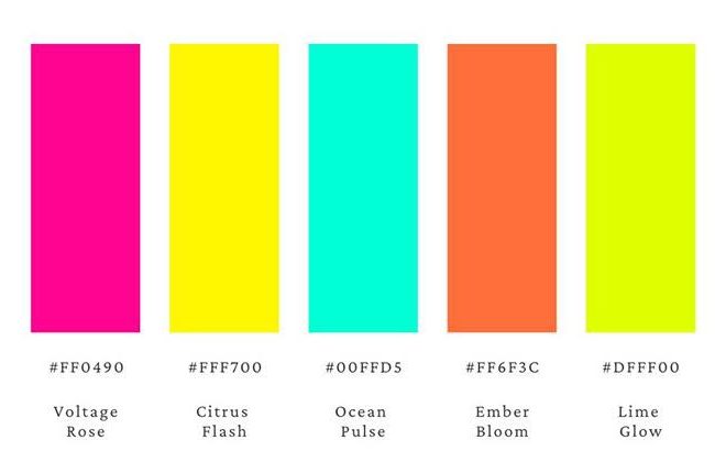
Beyond your staples, the bright spring palette bursts with an exciting array of accent colours to keep your wardrobe fresh and eye-catching. Think electric pink, zesty lemon, aqua teal, poppy orange, and brilliant chartreuse.
These hues stay true to your lively, dazzling vibe while adding a punch of fun or unexpected flair.
To wear them like a Bright Spring, anchor them with your staples. Pair an electric pink top with a bright ivory skirt or trousers for a striking contrast, or toss a poppy orange jacket over a crisp turquoise dress for a playful, confident combo.
A zesty lemon scarf can lift a fresh lime green outfit, while aqua teal shoes add a splash of cool brilliance to sunny yellow trousers. Keep it spirited and balanced, let one accent colour pop at a time to maintain that Bright Spring sparkle without losing your natural vibrancy.
Colours to Avoid as a Bright Spring
Your Bright Spring energy is all about clarity, warmth, and a punch of vividness—like sunlight breaking through a prism. To keep that dazzling spark front and centre, you’ll want to sidestep shades that dim your brilliance or muddy your natural glow. Here’s what to ditch and what to embrace instead.
Ditch Dusty Rose, Choose Clear Peony Instead

Dusty rose, with its muted, powdery vibe, drags down your vibrant clarity and makes you look a little washed out.
Swap it for a clear peony—a bright, warm pink that’s crisp and lively, amplifying your natural radiance with a pop that screams springtime freshness.
Ditch Slate Grey, Choose Warm Turquoise Instead
Slate grey is too cool and subdued for your dynamic palette; it dulls your shine and flattens your energy.
Reach for warm turquoise instead—a bold, clear hue with a sunny undertone that mirrors your vivid spirit and keeps your look electric.
Ditch Muddy Taupe, Choose Golden Lime Instead
Muddy taupe is a no-go; its murky, neutral tone clashes with your high-contrast glow, leaving you looking lacklustre.
Opt for golden lime instead—a zesty, warm-toned green that’s bright and punchy, perfectly syncing with your lively essence and adding a playful edge.
Ditch Soft Charcoal, Choose Rich Amber Instead
Soft charcoal lacks the depth and warmth you need; it’s too quiet and cool, smothering your natural fire.
Go for rich amber instead—a bold, golden brown that’s warm and saturated, grounding your look with a glow that enhances your Bright Spring brilliance.
Bright Spring Sister Palettes

New to seasonal colour analysis? Sister palettes are the vibes closest to your main season, near enough on the colour spectrum that they might just work for you too.
For Bright Spring, with its warm, vivid, and high-energy glow, the sister palettes are True Spring and Bright Winter. Let’s break it down!
For Warm Spring, with its golden, soft, and medium-warm energy, the sister palettes are True Spring and True Autumn. Let’s break it down!
True Spring Sister palette

True Spring is Bright Spring’s sunny sibling, sharing that warm glow but with a softer, less intense edge. It’s all about fresh, zesty hues like golden peach or clear coral, less punchy than Bright Spring’s vivid pops.
If Bright Spring’s your home, you can dip into True Spring’s gentler shades for a lighter lift without losing your sparkle.
Bright Winter
Then there’s Bright Winter, which cranks up the coolness and contrast. It’s still vivid but leans into icy blues and stark blacks, with a sharper edge than Bright Spring’s golden warmth.
If you’re a Bright Spring, you’ll shine in Bright Winter’s less cool tones, like a warm magenta, that keep your vibrancy intact without chilling your glow.
Hair & Makeup for Bright Springs
Bright Spring is all about that vivid, sunlit vibe, think warm, bold, and fresh, like a spring day bursting with colour.
Your hair and makeup should channel clear, vibrant tones and playful pops that play up your natural dazzle.
This bright spring palette is versatile enough for an effortless, radiant look or a bold, electric twist. Let’s dive in!
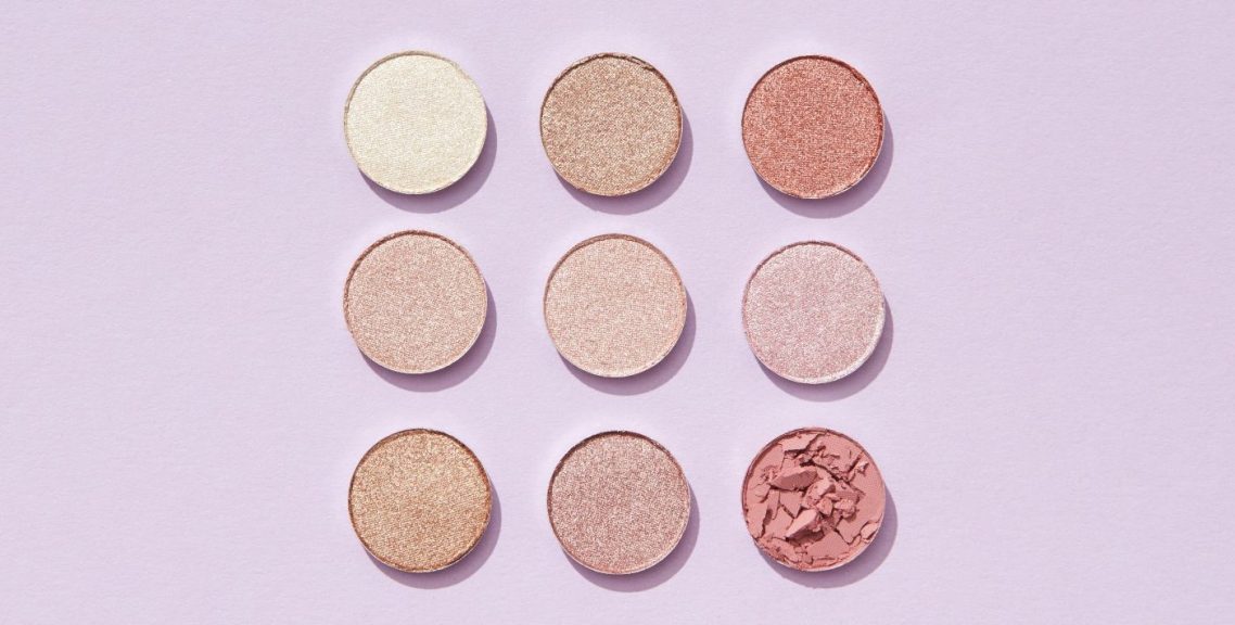
Makeup Magic for Bright Springs

Your makeup should feel like a burst of sunshine, vivid, uplifting, and never too soft. Here’s your guide to shades that’ll make you shine.
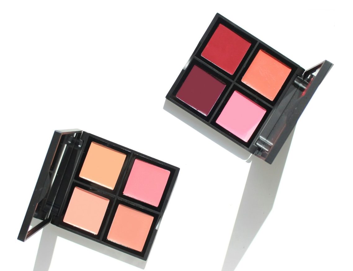
Lipstick
Best Shades: Vibrant Coral, Clear Fuchsia, Warm Poppy
Think vibrant coral that lights up your face or a warm poppy that feels bold yet fresh. Bonus tip: A glossy finish amps up that Bright Spring energy!
Blush
Best Shades: Gold, Rose Gold, Polished Silver
Gold is your go-to for that warm Bright Spring glow, rose gold adds a flirty twist, and polished silver works if it’s bold and clear, think of it as a nod to your winter edge. These metals harmonise with your bright spring colours perfectly.
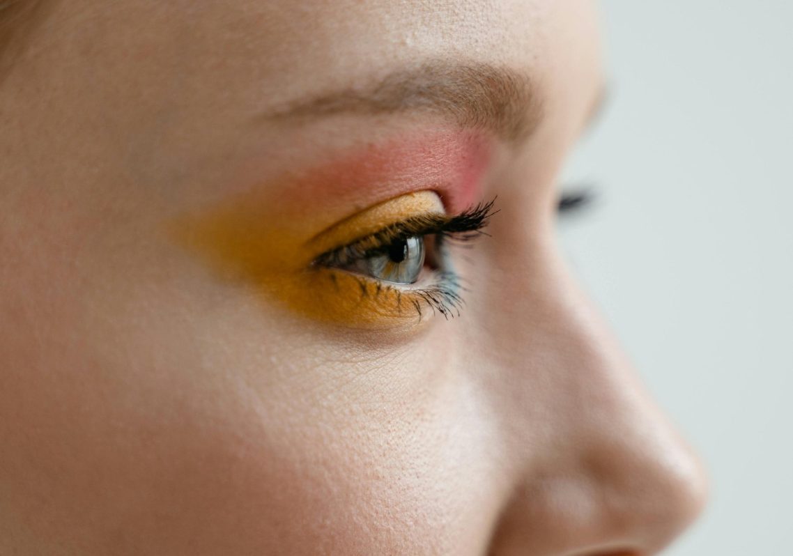
Eye Shadow
Best Shades: Golden Yellow, Aqua Teal, Rich Amber
Golden yellow is your staple, like sunlight in a pan. Aqua teal adds a playful, vivid twist, while rich amber brings warm sophistication. Pro tip: A shimmer finish catches the light and dials up your sparkle!
Jewellery/Metals
Best Shades: Gold, Rose Gold, Polished Silver
Gold is your go-to for that warm Bright Spring glow, rose gold adds a flirty twist, and polished silver works if it’s bold and clear, think of it as a nod to your winter edge. These metals harmonise with your bright spring colours perfectly.
Keep it radiant, matte looks can dull your vibrancy, so lean into glossy textures or a touch of highlighter to let your boldness shine. Want to go big? Try a vibrant coral lip with an aqua teal shadow, playful, striking, and totally you.
Hair: Vivid Vibes Only
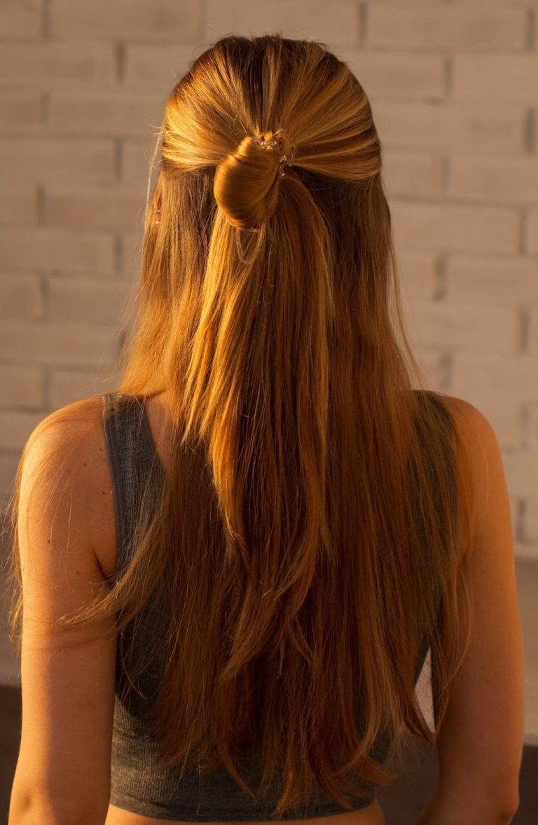
Best Shades: Gold, Bronze, Warm Copper
Your natural hair is your superpower, already buzzing with that Bright Spring clarity! But for a switch-up, stick to shades with a bold, warm base that keeps things vibrant and fresh. You’re made for that standout moment, most dyes naturally pick up your vivid charm.
- Best Hair Shades: Think bold blonde, vibrant brown, fiery red, or even a rich golden copper with a warm twist. These keep your bright spring palette popping.
- Highlights: Add some fun with clear, sunny streaks or a vivid balayage, think golden or coral tones that catch the light. Avoid muted or ashy highlights, they’ll dim your dazzle.
- Extra Oomph: Feeling adventurous? A glossy rinse in a bright shade, like warm apricot or clear champagne, can boost your vibrancy. Or go bold with a vivid accent, maybe a subtle turquoise streak if you’re daring!
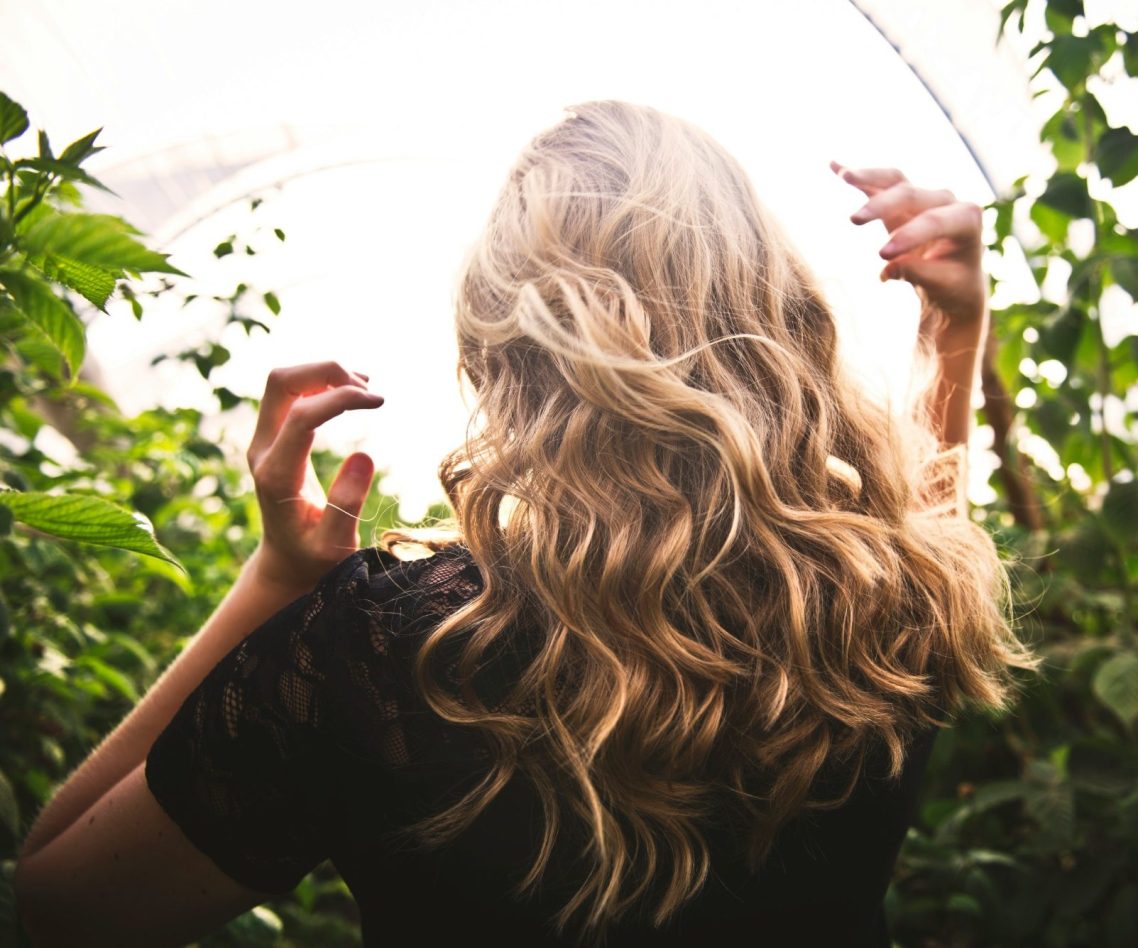
Play with texture too, bouncy curls or sleek, glossy strands amplify that lively energy. Steer clear of dull, muted dyes like ash blonde or soft black, they’ll drain your spark faster than on a cloudy day. Your hair should feel like an extension of your bright spring colour palette, bold, warm, and full of life.
A Little Extra Bright Spring Sparkle
Here’s where you can really dazzle: Bright Spring isn’t just about colour, it’s about that vivid, youthful energy. Your makeup and hair can reflect that bold, playful spirit.
Think of popping on a clear fuchsia lip tint for daytime ease or a golden yellow eyeliner for a twist on your evening look.
And if you’re a Bright Spring flirting with your sister palettes, True Spring or Bright Winter, you can borrow their tricks. Maybe a softer coral from True Spring for a fresh vibe, or a punchy magenta from Bright Winter to crank up the drama.
The takeaway? You’re a walking burst of sunshine, and your hair and makeup are your tools to let that glow run wild. Whether you’re keeping it simple with a sunny coral blush or turning up the dial with a poppy orange lip, Bright Spring is all about clarity, warmth, and a little fun, so go ahead and shine!
FAQ: Everything You Need to Know About Bright Spring
Got questions about rocking the Bright Spring vibe? We’ve got answers! Here’s your guide to nailing this vivid, warm season, plus tips to glow like the bright springtime star you are.
Q: Can Bright Springs wear black?
A: Black’s tricky, it can work if it’s bold and paired with your vivid hues, but it’s not your bestie. Instead, try rich amber or deep teal for a warm, vibrant twist that keeps your bright spring palette popping. Add a sunny yellow scarf for extra oomph!
Q: What’s the difference between Bright Spring and Bright Winter?
A: Bright Spring and Bright Winter are bold cousins with different vibes! Bright Spring is warm, vivid, and sunny, think vibrant coral or golden lime.
Bright Winter is cool, stark, and intense, like icy blue or pure black. If your glow feels more golden than frosty, Bright Spring’s your match. Test it: Hold up a warm turquoise, Spring, versus a cool magenta, Winter, your face will light up with the winner!
Q: How do I know if Bright Spring or True Spring is my best season?
A: True Spring is warm, bright, and fresh, think clear peach, while Bright Spring is warm, vivid, and punchy, think electric pink. Try a golden yellow, Bright Spring, versus a soft apricot, True Spring, which makes your skin sing?
If it’s a toss-up, our Free Colour Analysis Quiz can help!
Q: Are there any Colours Bright Springs should avoid?
A: Yep, steer clear of anything muted or dull! Dusty roses, slate greys, and muddy taupes will drain your vibrancy. Stick to clear, warm hues like vibrant coral or golden lime in your bright spring clothes, if it feels faded or flat, it’s not your jam!
Q: Can Bright Springs pull off bold makeup looks?
A: Absolutely! Your bright spring colour palette thrives on clarity and warmth, so bold is your playground. Try a vibrant coral lip or a golden yellow shadow, keep it glossy and radiant, and you’ll turn heads while staying true to your vibe.
Q: What’s the best way to test if I’m a Bright Spring at home?
A: Grab some fabric or clothes in Bright Spring shades, think vibrant coral, sunny yellow, or aqua teal, and hold them near your face in natural daylight, no tricky indoor lights!
Does your skin look radiant and alive, your eyes brighter, your cheeks glowing? Now try a muted shade like dusty rose or slate grey, does it make you look flat or tired?
If the vivid, warm hues win, you’re likely a Bright Spring. Bonus: Drape a gold scarf versus a silver one. Gold’s your clue as to whether it lifts your whole vibe in your bright spring palette!
Q: How do Bright Spring Colours Work with My Wardrobe?
A: Your wardrobe should feel like a burst of sunshine, vivid, warm, and full of life! Build around staples like a coral blouse, turquoise trousers, or a sunny yellow dress.
Mix in neutrals like bright ivory, skip dull greys or beiges, and don’t shy away from pops like electric pink or aqua teal. Layer with gold accessories, and your bright spring outfits will dazzle, literally.
We need your consent to load the translations
We use a third-party service to translate the website content that may collect data about your activity. Please review the details in the privacy policy and accept the service to view the translations.